Omikron Skin Care
________
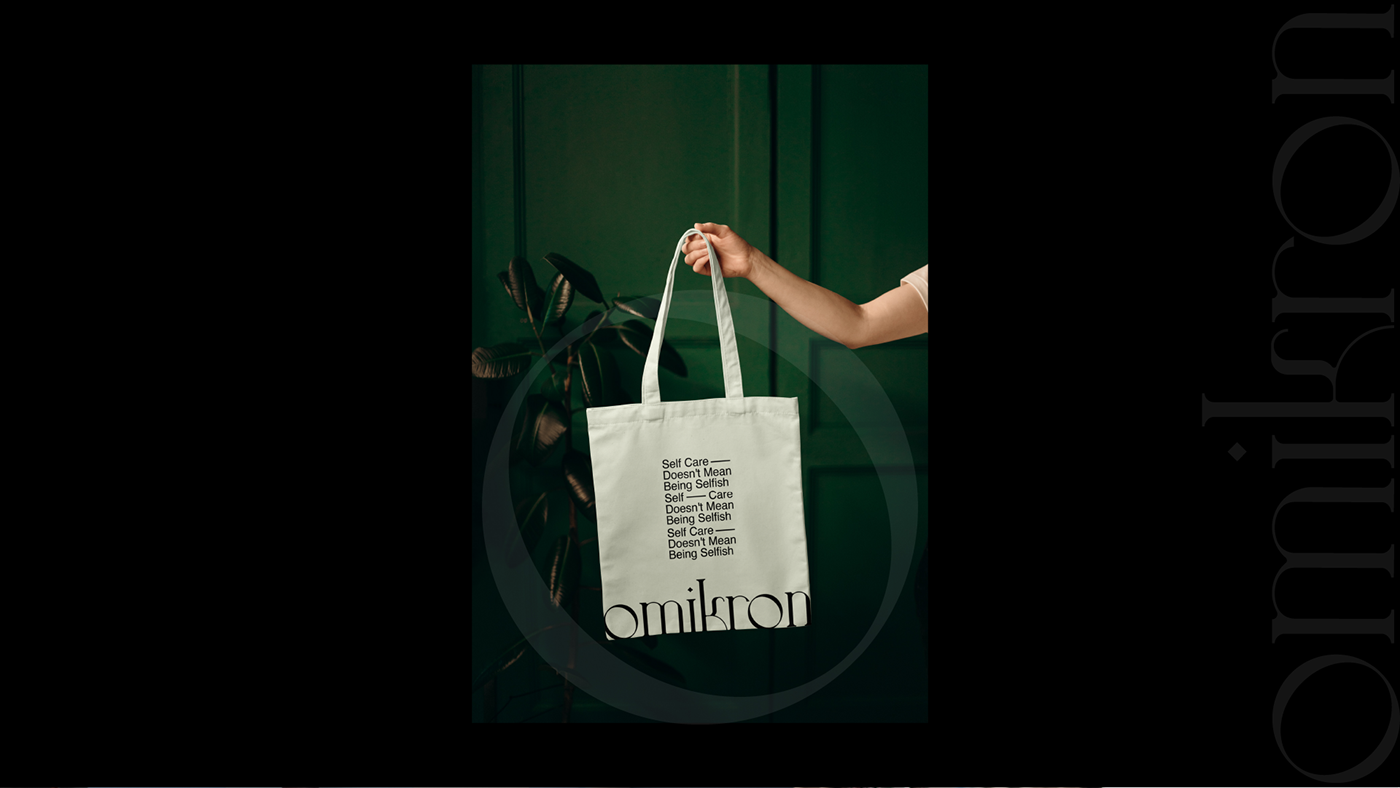
Brand Identity Design, Art Direction and Packaging Design
The beauty industry is a tricky and manipulative industry, feeding and profiting off the backs of our insecurities. Bringing things back to basics, Omikron - a Zurich based Skincare brand wanted to see something that presented themselves as a proven, hassle-free skin care routine that you can have full confidence in.
A routine that gives you the headspace and sanity to focuson what really matters in life. A skincare brand that actually encourage a sense of self-care, not inducing a sense of inadequacy or a false sense of pressure. I wanted to create something clean and trend-conscious. Something that visually communicated the good-hearted thought process behind the brand. Something that people could recognise and relate to within the beauty industry, to instill a sense of trust in the early adopters of the product.
The Omikron brand needed to exude experience, confidence and empowerment whilst still remaining approachable and personable. The name "omikron" came from the Greek letter "O", which is a letter that symbolises the wholeness but also the simplicity that a product can have without having unnecessary elements. The final logo mark uses a light and simple customised typeface to provide stability and simplicity with an unpretentious approach to a hig-end product.
Location: Zürich, Switzerland